Table of Contents
When it comes to choosing paint colors for your dining room, every shade can have a profound impact on the atmosphere and dining experience. Certain colors can enhance the space, making it feel warm and inviting, while others can create tension, discomfort, or even reduce appetite. In this comprehensive guide, we’ll delve into the paint colors you should avoid in a dining room and why these choices may lead to less desirable results for this key area in your home.
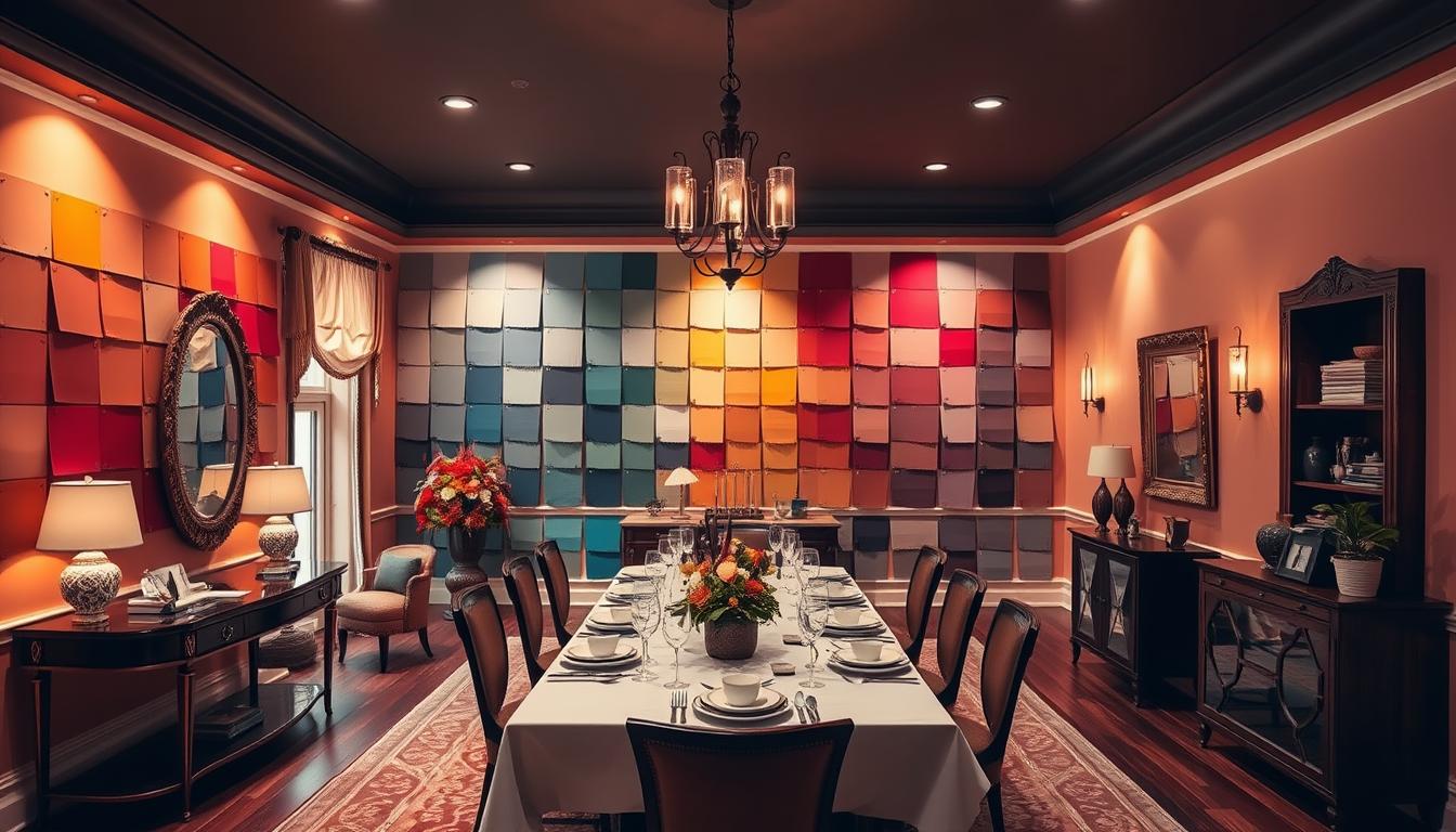
The Psychological Impact of Colors in Dining Rooms
The dining room is more than just a space to eat; it’s a social and emotional center of your home. The colors used can dramatically affect not only the mood but also the dining experience itself. Studies have shown that certain hues can stimulate appetite, while others suppress it, impacting how you and your guests feel during meals.
1. Avoid Bright White: Too Sterile and Uninviting
Bright white is often considered a clean and crisp color for many rooms, but for a dining room, it may backfire. Its stark nature can make the room feel too sterile and cold, detracting from the warmth and intimacy that a dining room should evoke. While white is neutral and versatile, it often lacks the richness needed to create a cozy dining experience.
Alternative: Opt for warmer, off-white tones like creamy beige or soft ivory. These shades still offer the neutrality of white but with added warmth and depth.
2. Stay Away From Dark Brown: Overbearing and Claustrophobic
Dark brown, while earthy and strong, can feel heavy and overbearing in a dining room. This color can shrink the visual space, making the room feel smaller and more enclosed. It can also absorb natural light, leaving the room feeling dim and less inviting.
Alternative: Consider lighter shades of brown, such as taupe or mocha, which retain warmth without overwhelming the space.
3. Avoid Yellow-Green Shades: Unappetizing and Jarring
Yellow-green hues may seem like a fun, fresh choice, but in a dining room, they can be unpleasant. These shades can have an unappetizing effect, as they often evoke associations with spoiled or unripe food. The jarring contrast between yellow and green can also be visually uncomfortable for extended periods.
Alternative: Softer greens, such as sage or olive, can provide a calming, nature-inspired atmosphere without the harshness.
4. Stay Clear of Bright Red: Too Stimulating and Overpowering
Red is known for its appetite-stimulating properties, which may seem ideal for a dining room. However, bright or intense red can lead to overstimulation, causing anxiety and discomfort during meals. This overpowering hue can dominate the space, making it difficult to relax and enjoy the dining experience.
Alternative: Muted reds, like burgundy or brick, offer the same warmth and appetite-boosting effects without the intensity. These shades create a cozy, intimate atmosphere perfect for dining.
5. Don’t Use Neon or Bright Colors: Distracting and Inappropriate
Neon or overly bright colors are best reserved for children’s playrooms or art studios. In a dining room, these hues can be distracting, overwhelming, and inappropriate for an adult, sophisticated dining space. Bright pinks, oranges, and neon blues can detract from the main purpose of the room: to eat and connect with others.
Alternative: Stick with subdued, muted tones that blend effortlessly with dining room furniture and décor. Colors like soft coral, light grey, or dusty rose offer subtle elegance without distraction.
6. Avoid Blue in Its Coolest Tones: Appetite Suppressing
Blue is commonly associated with calm and serenity, but in a dining room, especially in its cooler shades (think icy blue or powder blue), it can suppress appetite and diminish the overall warmth of the space. People naturally associate blue with things that aren’t edible, such as mold or spoiled food, making it less appealing in a dining context.
Alternative: If you love blue, consider warmer shades like teal or dusty blue. These colors maintain a sense of calm without the appetite-suppressing qualities of cooler blues.
7. Skip Black: Dark and Overwhelming
While black can be a chic, modern choice for certain spaces, it’s generally too intense for a dining room. The darkness of black absorbs light, creating a gloomy atmosphere that can make the dining room feel oppressive. It’s also visually heavy and can overshadow any other elements of décor.
Alternative: Charcoal grey or deep navy can offer the drama of black but with a bit more light and warmth. These hues add sophistication without overwhelming the room.
Thoughtful Color Choices for a Perfect Dining Room
Choosing the right color for your dining room is crucial in creating an inviting, comfortable, and enjoyable environment. Avoiding the wrong colors—those that are too bright, too dark, or unappetizing—can help you design a space that enhances both the look of your home and the experience of sharing meals with loved ones. Opt for warm, neutral, or muted tones to create a balanced and inviting atmosphere.